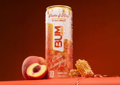
BUM Energy x Ella Langley
Peaches & Honey
Building a limited-edition flavor and visual world inspired by Ella Langley’s Dandelion era.
Brand: BUM Energy
Partner: Ella Langley
Role: Creative Direction · Packaging Design · Campaign Art Direction · Production Oversight
Key Delierables: Limited-Edition Can · Walmart 12-Pack · PR Kit · Cross-Channel Launch System
Launch: September 2026
PROJECT OVERVIEW
Peaches & Honey marked BUM Energy’s first collaboration with a musician and became one of the brand’s most visible partnerships.
The project began with a broader exploration of Southern-inspired flavors, colors, and visual directions informed by Ella Langley’s Dandelion album and tour. Her team provided approved photography, typography, logos, and brand colors, while Ella selected several potential flavor concepts. Peaches & Honey was ultimately chosen for development.
I led the visual direction and owned the final design of the limited-edition can and 12-pack. I created a flexible visual system that could carry Ella’s identity through packaging, campaign creative, retail materials, merchandise, events, and digital touchpoints while remaining unmistakably BUM Energy.

MY ROLE
As the creative lead, I developed the project’s core visual language, including the color palette, fine-line illustrations, composition, metallic honey treatment, and packaging hierarchy.
I also originated the direction for the on-pack creed and supporting copy, incorporating feedback from BUM Energy leadership and Ella’s team through the company’s internal partnership lead.
Once the packaging direction was approved, I briefed and guided the design team as the system expanded across billboards, on-stage screens, PR kits, merchandise, social media, web banners, sell sheets, shippers, and other launch materials. I reviewed each execution for consistency before it moved through leadership and partnership approval.
CREATIVE DIRECTION
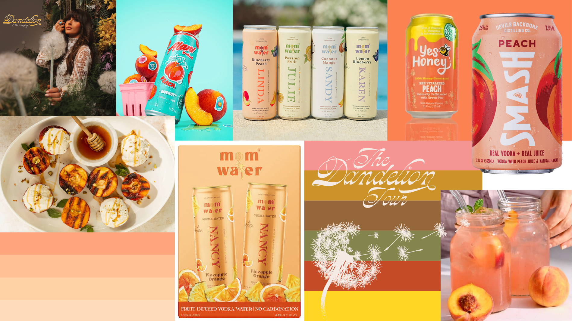
I began with two established visual languages: BUM Energy’s recognizable retro packaging and the approved colors, typography, photography and logos from Ella Langley’s Dandelion album and tour.
The goal was not to place Ella’s name on an existing BUM can. The collaboration needed its own identity while still feeling connected to both brands.
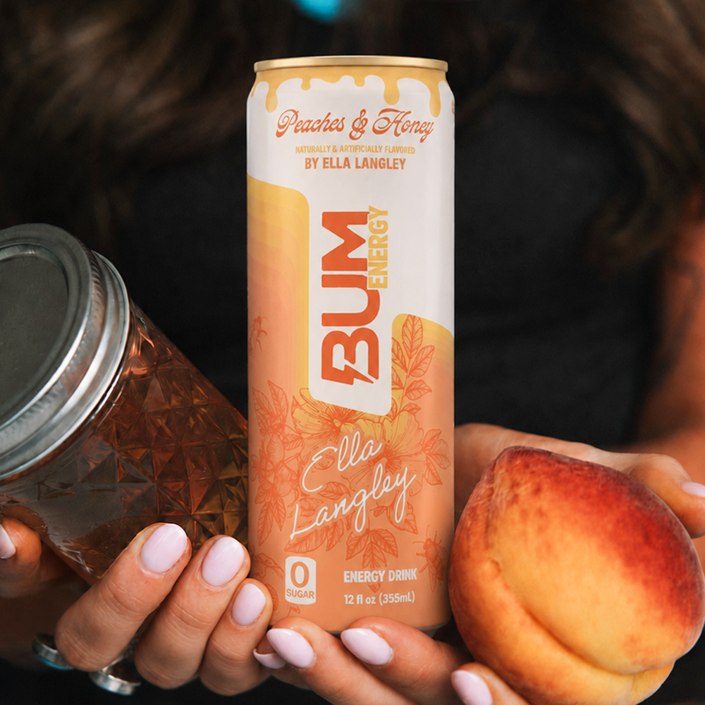
I developed a softer, Southern-inspired visual system using fine-line illustrations, warm peach tones, metallic honey details and a more delicate composition. The result felt feminine and elevated without losing the confidence and shelf presence of BUM Energy.
Every element was also designed with the wider launch in mind. The illustrations, colors, honey treatment and typography could be separated, resized and recombined across packaging, retail, digital and event materials.
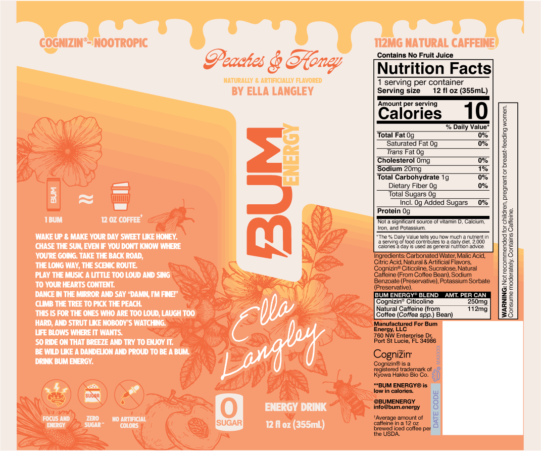
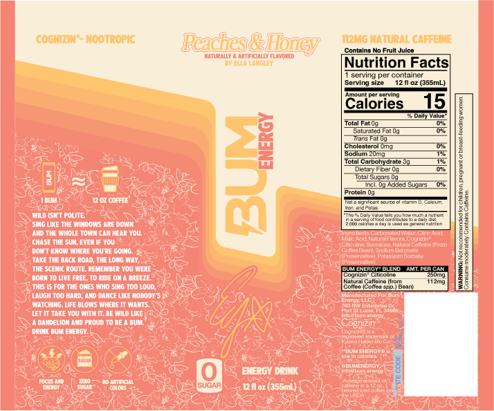
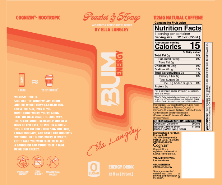
Final Approved Label
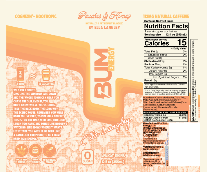
Label Creative Process


PACKAGING DESIGN
The project began before the final flavor had been selected. I explored several Southern-inspired directions, including sweet tea and other flavor concepts, using Ella’s album and tour as the creative foundation.
After Ella selected a shortlist of flavors, Peaches & Honey was chosen for development. I refined the concept into the final can design, creating the color palette, fine-line illustrations, honey drip, composition and packaging hierarchy.
I also developed the idea for the on-pack creed and supporting copy, incorporating feedback from leadership and Ella’s team through our internal partnership lead.
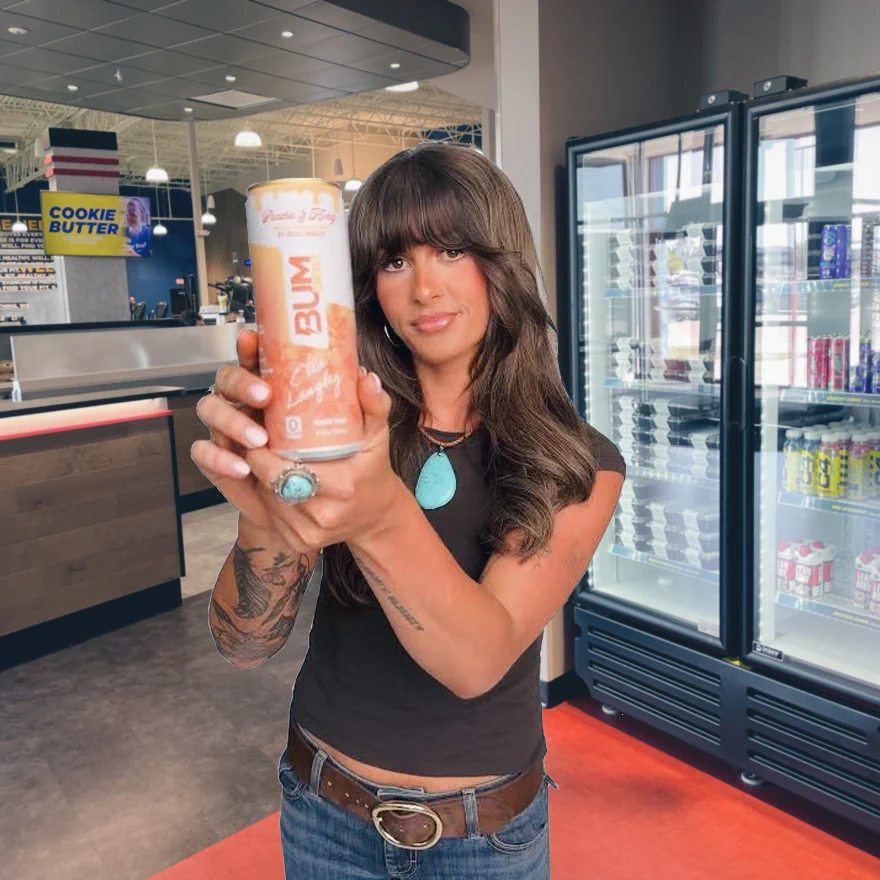
The finished packaging needed to feel attractive, delicate, strong and distinctly limited edition. It also needed to communicate the flavor immediately and remain recognizable from every angle.
FROM CAN TO CAMPAIGN
The can established the visual foundation for the entire launch.
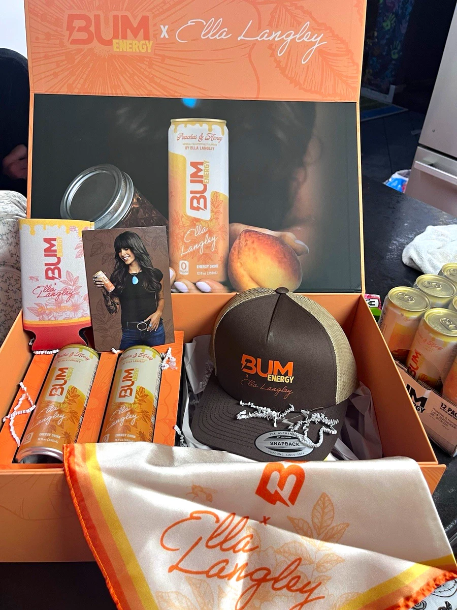
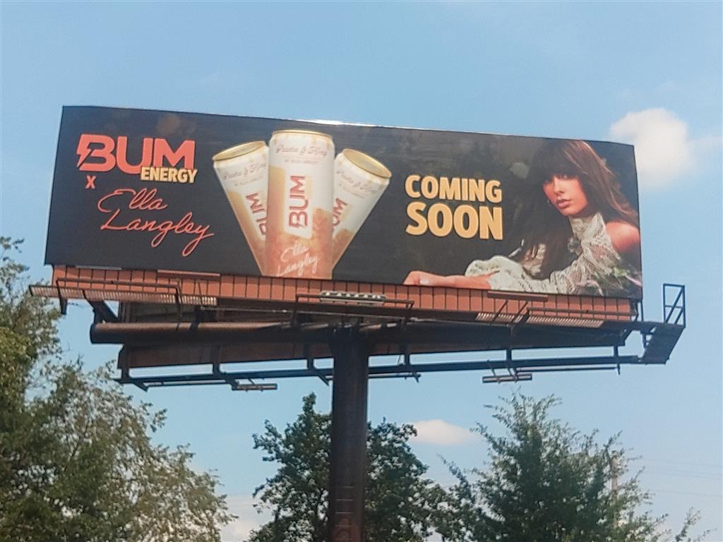
Once the packaging direction was approved, I translated its core elements into a flexible campaign system and briefed the designers working across the rollout. The color palette, illustrations, typography and honey details were extended into billboards, on-stage screens, PR kits, merchandise, social media, web banners, sell sheets, retail materials and shippers.
I reviewed the supporting creative before it moved through leadership and partnership approval, helping the team maintain consistency across very different formats and deadlines.
This approach allowed multiple designers to contribute to the launch without losing the visual world established by the original packaging.
PR KIT AND RETAIL EXPANSION
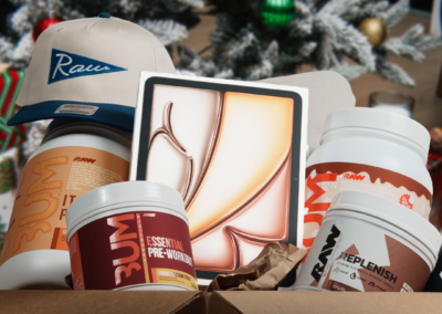
Alongside the limited-edition can, I co-designed the launch PR kit and helped carry the packaging story into a more tactile brand experience.
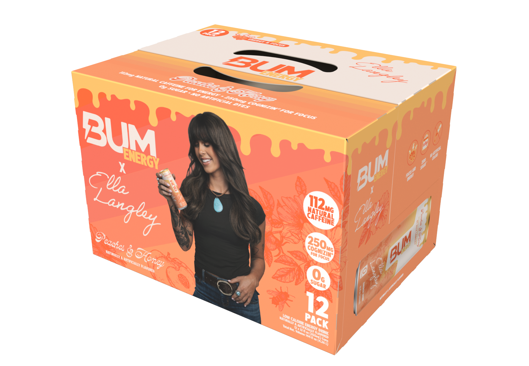
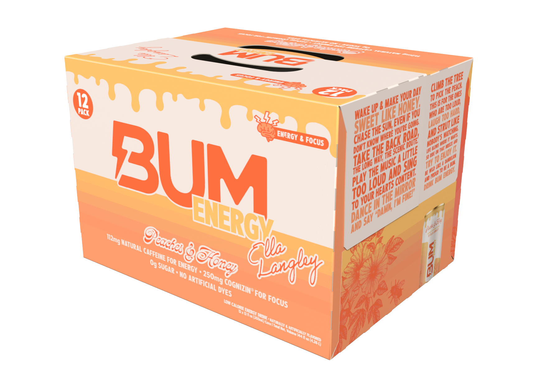
As interest in the collaboration grew, the project expanded beyond its original direct-to-consumer, specialty retail and event distribution. I was asked to create a retail multipack, completing the packaging artwork within one day to meet the accelerated production schedule.
The multipack used the same visual system as the can, allowing the design to scale quickly without feeling like a separate extension of the launch.
PRODUCTION AND PROOFING
The metallic honey treatment became one of the most distinctive elements of the final can, but it was also the largest production challenge.
The metallic-gold ink needed to coordinate with every yellow and gold element throughout the artwork. The first physical proofs did not reproduce the color consistently, so I worked through three pilot rounds with the manufacturer, reviewing the finish and adjusting the files until the honey details felt cohesive across the entire package.
I remained responsible for approving the color, finish and final production artwork. That process helped preserve the original creative idea while adapting it to the realities of commercial can printing.
LAUNCH AND RESPONSE
Peaches & Honey officially launched in September 2026 as BUM Energy’s first musician collaboration and one of the brand’s most visible partnerships.
The limited-edition flavor generated strong organic attention across TikTok and other social platforms. Fans shared the product, created skits around the collaboration and regularly commented on both the flavor and the can design.
The response demonstrated that the packaging was doing more than identifying the product. It gave fans something recognizable, collectible and closely connected to Ella’s world while introducing BUM Energy to a wider audience.

THE RESULT
Peaches & Honey grew from a single limited-edition can into a complete launch system spanning packaging, digital, retail, merchandise, PR and live events.
The project required concept development, hands-on design, production problem-solving, team leadership and fast adaptation when the release schedule and retail scope changed.
More importantly, it showed how a strong packaging concept can become the foundation for an entire brand experience.